SKILLS
TEAM
TOOLS
Card Sorting
Content Strategy
Navigation Design
Prototyping
Information Visualization
Nina Bouseh
Ummen Naseer
Alifiyah Hussain
Figma
Miro
ROLE
I conducted card sorting sessions, developed an information architecture diagram, crafted a responsive mobile navigation design on Figma, and assisted in constructing a business report.
SOLUTION
PROBLEM
-
Create an intuitive website that is easy to navigate, providing excellent search features, while ensuring accessibility for older audiences.
-
Make the website an extension of the museum, highlighting an online collection
-
Attract younger generations, including students from elementary, secondary, and university level education.
In collaboration with the University of Toronto, the Textile Museum of Canada sought input for the improvement of their website structure and optimization of their navigation system.
The existing website structure posed significant challenges for users attempting to access essential information related to programs, community outreach, museum tickets, and donations, primarily due to disorganization within the information sections.

-
I conducted a content audit, examining each element on the website with a focus on:
-
Importance and relevancy of the content
-
Identifying elements that could be streamlined for enhanced accessibility
-
Picking out gaps for potential new content or features
METHOD
Content Audit
To compile a comprehensive list of the museum's content, I used Dynomapper, generating around 1000 links, covering pages, page sections, external resources, PDFs, and videos.
APPROACH
RESEARCH
A review was conducted to remove duplicates, inaccuracies, uncover hidden content and repair or remove broken links. The content list was refined to 150 links that served a distinct purpose.
Card Sort
UNDERSTANDING THE USER
DISCOVERY

From our audit, we took 50 pieces of content to conduct a card sort activity with 10 participants on Miro. Participants strategically aligned with the Museum's objective to engage with students, young adults, and educational institutions
-
Card sorts were conducted in 30-minute intervals.
-
15 minutes for card sorting and 15 minutes for discussion
-
Participants were asked to “think out loud” while they sorted and categorized cards
METHOD
ANALYZE
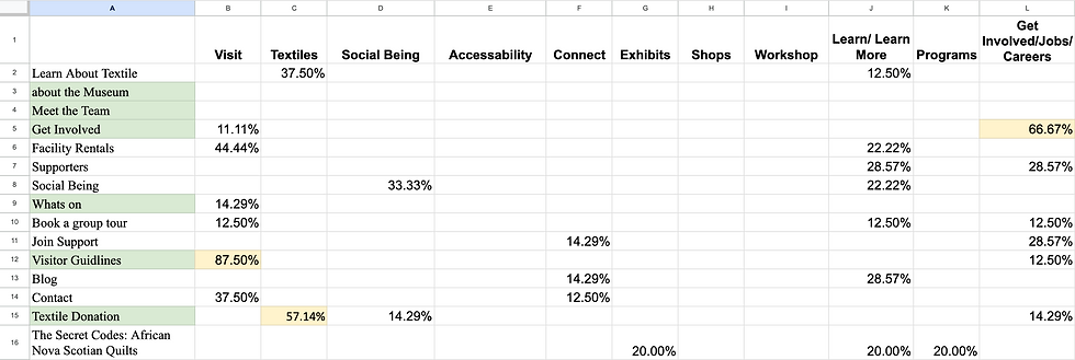
Card sort results were compiled in a spreadsheet
ANALYZING THE DATA
The spreadsheet helped us identify recurring trends and determine the appropriate hierarchy for information, placing items at higher or lower levels as needed.
FINDINGS
Of users believe 'Jobs' should be under 'Get Involved.'
Of users believe 'Annual Reports and Plans' should be under 'About"
Of users believe 'Visit' should be a main category.
87%
Of users believe that 'Gatherings' should be found under 'Events'
Of users believe "Library' should be a main category
Of users expect to purchase tickets when in the 'Visit' section.

100%
67%
50%
72%
75%
STRUCTURING
INFORMATION ARCHITECTURE
The IA is designed and iterated upon to ensure user-friendliness and alignment with museum objectives. I structured the website architecture to avoid exceeding four levels of hierarchy, as deeper navigation can hinder findability.

Hierarchy and Navigation:
-
First Level: Primary Navigation - General labelling for intuitive exploration.
-
Second Level: Specific categories under the primary section.
-
Third and Fourth Levels: Deeper content accessible through second-level categories.
Balancing Breadth and Depth:
-
Seven main categories strike a balance between breadth and depth.
-
Depth is limited to four levels for easy discoverability.
OVERVIEW
REDESIGN
NAVIGATION DESIGN
Prototype
In Figma, we created a mid-fidelity prototype to replace the museum's current primary navigation system. Our design focused on user engagement, accessibility, and discoverability
Check out my prototype below! Click around to see how it works!
Primary Navigation
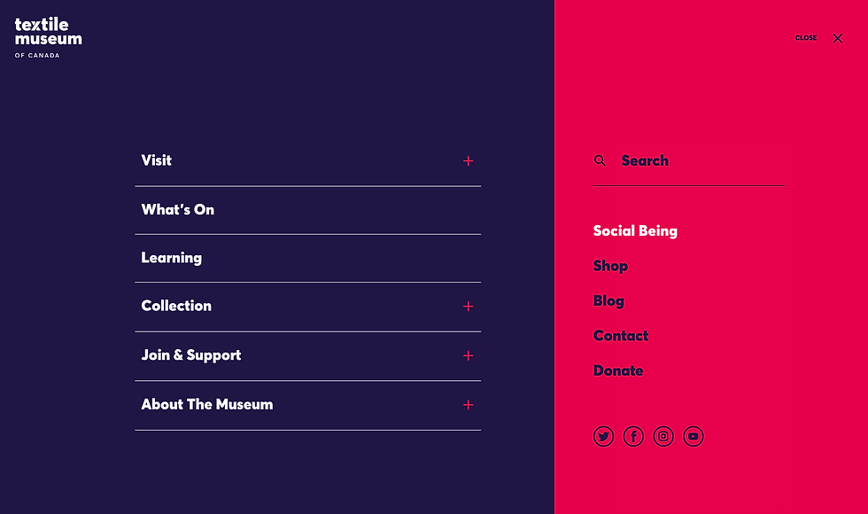
Current design: uses a hamburger menu which hides primary navigation elements.

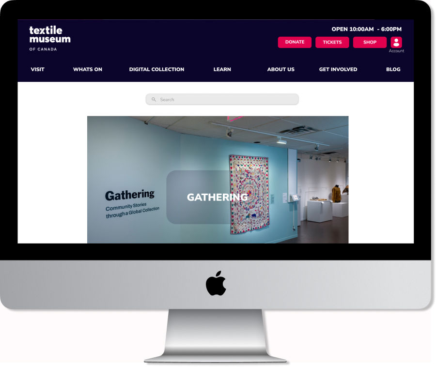
Purposed design: Incorporates a horizontal menu bar at the top of the page


PURPOSED DESIGN
-
Enhances Visibility and Accessibility
-
Primary navigation is always visible eliminating the need for extra clicks to reveal the menu and reducing cognitive load.
-
-
Streamlined User Journey
-
Features seven primary categories, allowing the user to narrow down what they are looking for in a way that is not overwhelming
-
-
Increased Discoverability and Engagement:
-
A transparent display of main categories and their subcategories uncovers content that users might not have initially sought.
-
Utility Navigation
Purposed design: Incorporates a utility navigation bar in the header streamlining access to four key functionalities: “Donate,” “Tickets,” “Shop,” and a “Profile” page.
-
Placement addresses user accessibility and promotes essential aspects of the museum’s business.
Utility Navigation bar is highlighted in purple.

Purposed design:
-
Access Tickets with Reduced Clicks
-
Offers a direct Tickets link, reducing the user journey from four clicks to one.
-
-
Visible Shop Link for Increased Engagement
-
Shop option in the utility navigation ensures constant visibility, potentially increasing curiosity and boosting conversion rates with merchandise just a click away.
-
-
Profile Page for Personalized Experience
-
Login/Profile button promotes deeper engagement by allowing users to save favourites and bookmark Tutorials, enhancing the overall personalized experience.
-
Faceted Navigation
Integrated into the Digital Collection and Video Tutorials/Demos page as a persistent side panel for a dynamic, user-friendly experience.
-
Currently: video content is accessible via external links to Google Drive and Vimeo
-
Purposed: To enhance accessibility, we recommend they should be integrated into the website so that users can access and find information seamlessly.

Purposed design:
-
Digital Collection: The side panel enhances search intuitiveness and efficiency, replacing the hidden menu. Visible filters showcase diverse items, fostering deeper interaction.
-
Video Tutorials: Distinct categories address the current lack of filtering options.
Footer
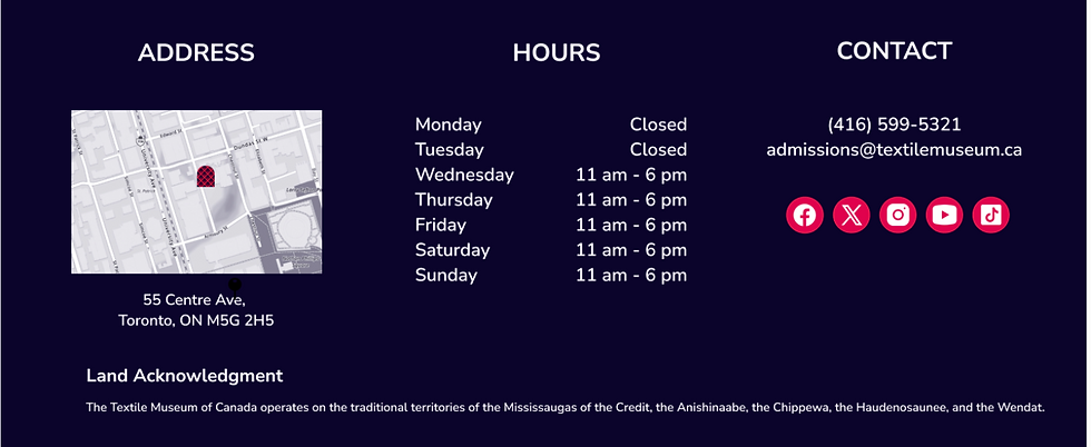
The redesign of the footer provides quick access to key information and resources.
Current Museum Footer

Purposed Redesign Footer

RESPONSIVE DESIGN
A working prototype for the responsive web design on a mobile interface was created in Figma and can be found below
Check out my prototype below!
Primary Navigation
In my redesign, I incorporated a space-efficient hamburger menu. Tapping a downward arrow reveals the second level of the hierarchy in an accordion-style section for efficient content scanning. This design choice effectively manages page length.
Hamburger menu opened
Accordion-style section expanded


An accordion allows users to gain an overview of available sections while quickly expanding and collapsing various stems of the hierarchy to get a sense of content.
I relocated the utility bar to the bottom of the hamburger menu. Each utility is represented by icons, saving space and providing users with a clear understanding of their functions
Users can choose between "current," "future," and "past" options to filter the displayed content. To optimize screen space, I transitioned from a tab to a filter system, separating the filter selection onto a dedicated screen.
Utility Navigation
Utility bar highlighted with purple box.

Faceted Navigation
User is shown all available content in "What's On" page
User taps “Exhibition” tab and sees only exhibition content
Users can add filters to further narrow their search

Users selects “current” filter.
User returns to "What's On" page and is shown selected filters
